My Key Contributions
User Research, Product Strategy,
Interaction, Visual Design, Prototyping
& Testing, Pitching
Design Tools
Figma
Adobe XD
Adobe Illustrator
Keynote
The Team
2 x UX/UI Designer
Duration
Four weeks sprint
Background/Context
Southern Nevada Conservancy had a fantastic main site, but its e-commerce sibling felt like the odd one out. Our mission? Make them twins, especially when users hit the ‘Shop’ button. This UX design journey aimed to create not just a visual makeover but a delightful, user-centric shopping adventure.
Conflict
Ever tried wearing mismatched shoes? Uncomfortable, right? That’s how users felt transitioning between the sites. The conflict was real. Our challenge? Blend these digital outfits into a stylish ensemble that didn’t just look good but felt right.
Rising Action
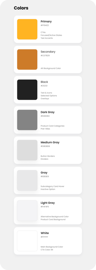
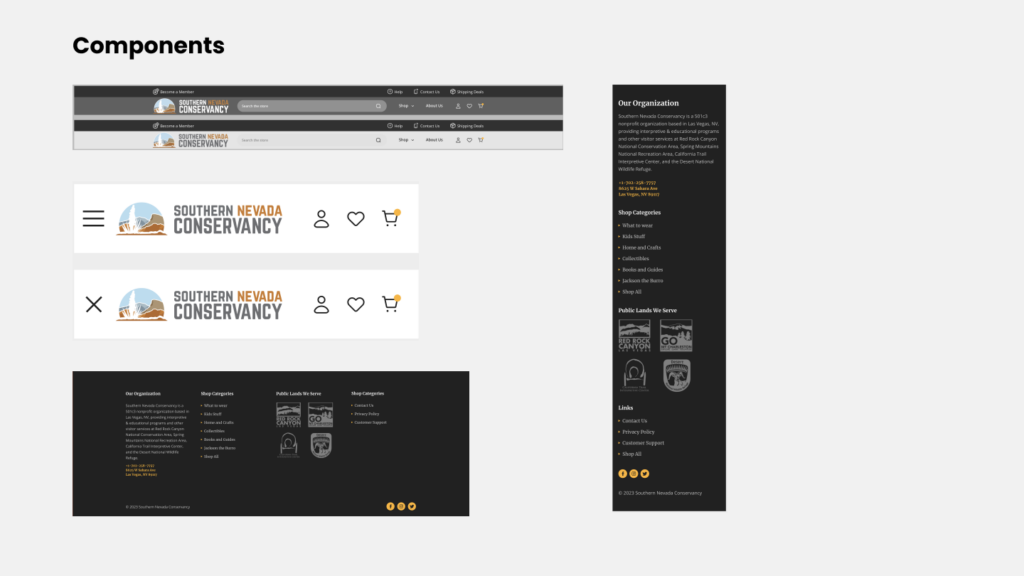
We used the same colors, cool pictures, and a bit of digital magic. Custom header, footer, homepage, and menu – our design tools. We created a look that felt like home for Southern Nevada Conservancy.
Climax
Ever tried wearing mismatched shoes? Uncomfortable, right? That’s how users felt transitioning between the sites. The conflict was real. Our challenge? Blend these digital outfits into a stylish ensemble that didn’t just look good but felt right.
Falling Action
But we didn’t stop there. We asked people what they thought. Their ideas helped us fine-tune everything. It was like tuning a guitar for the perfect sound. We made sure every click felt just right for users.
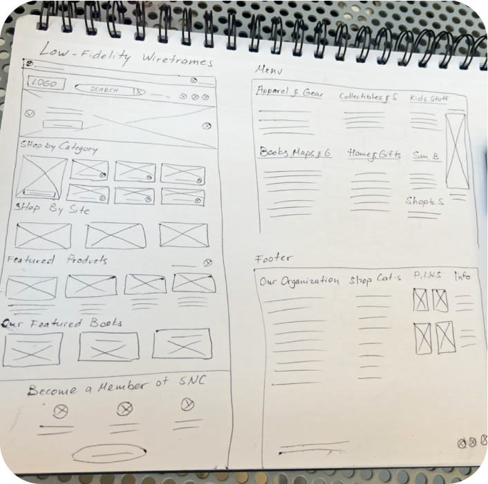
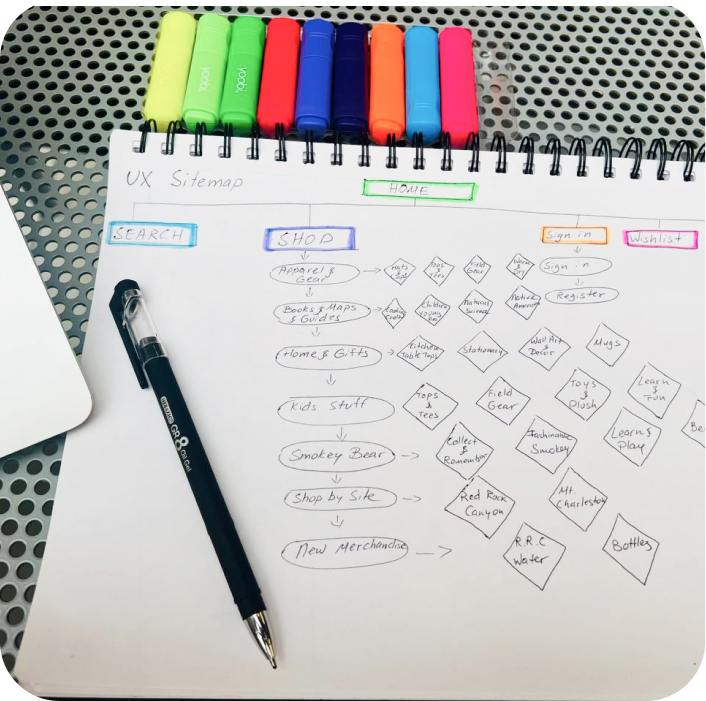
Ideation & Low Fidelity Wireframe
Armed with insights from the research phase, I started sketching ideas for a custom header, footer, homepage, and navigation menu. The focus was on creating a visually cohesive design that resonated with the Conservancy’s identity. Translating sketches into tangible wireframes, I laid the foundation for the new design. The wireframes were iteratively refined based on usability principles and feedback.
Prototyping
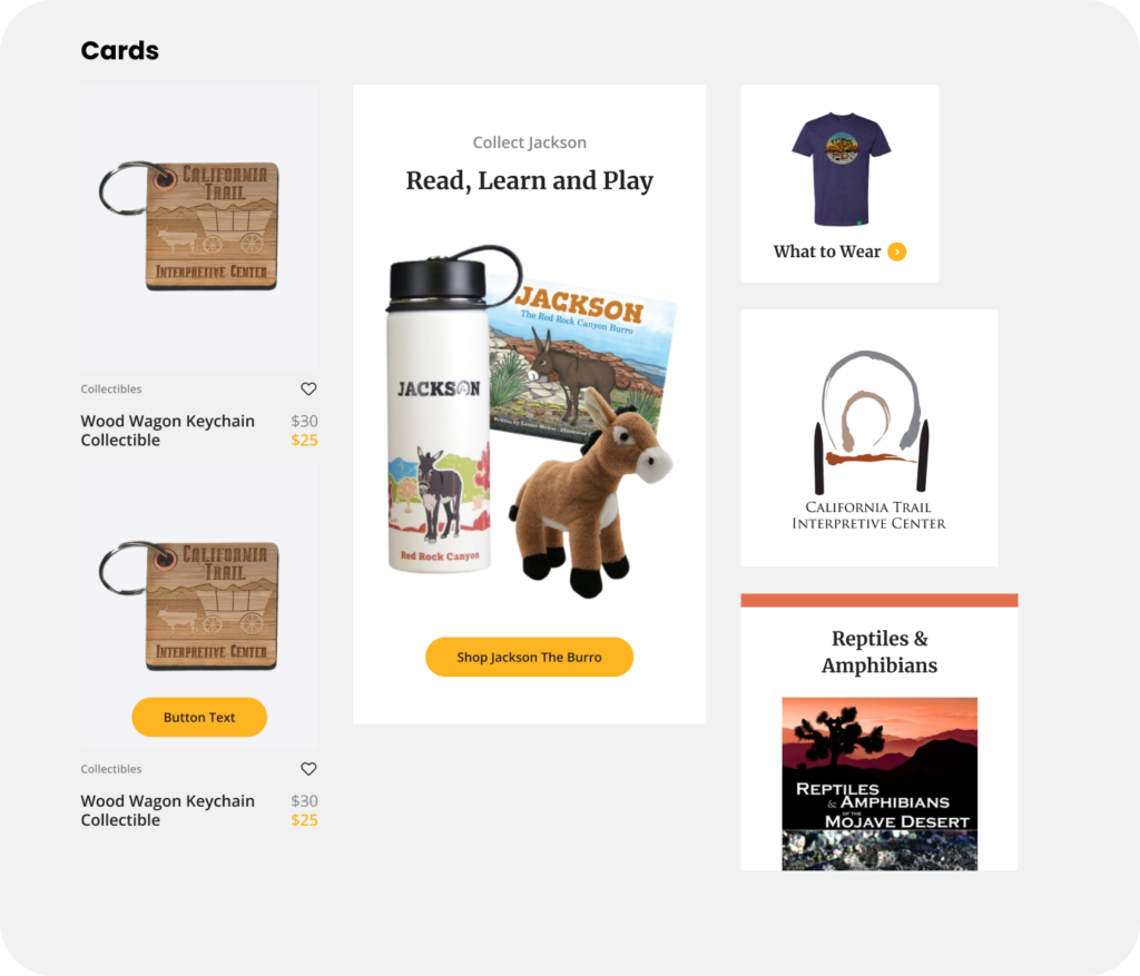
Prototypes were developed to simulate user interactions, providing a tangible preview of the proposed design. With the wireframes as a guide, I focused on creating a design that seamlessly blended the e-commerce site with the main site.
Brand colors were strategically integrated, and captivating imagery was selected to mirror the beauty of Southern Nevada’s landscapes. The visual design aimed to tell a story and establish an emotional connection with the users.
User Testing
User testing played a crucial role in refining the design. Potential users were engaged to explore the platform and provide feedback on the overall experience. Insights gathered were instrumental in identifying pain points and making iterative adjustments to enhance usability and address concerns.
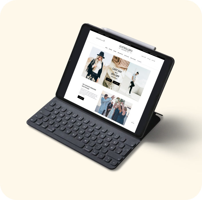
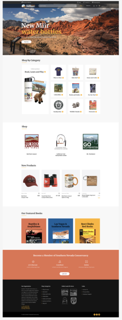
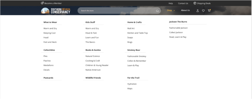
Before the User Testing
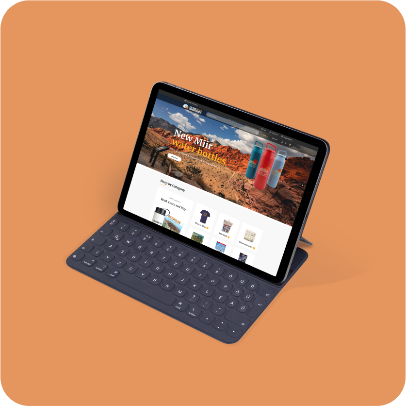
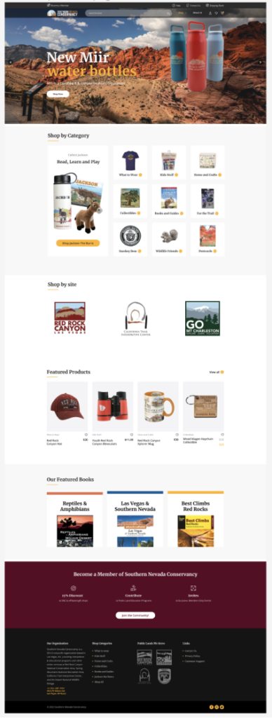
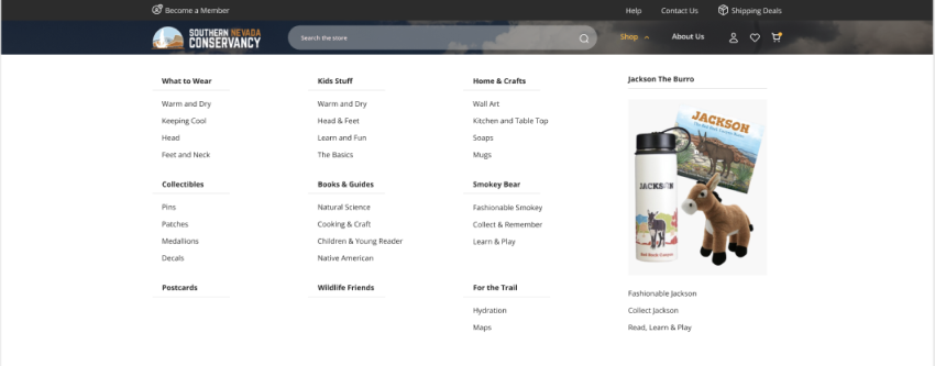
After the Iterative Testing
Before
After
Implementation
The final design was handed over to the development team for implementation. Attention to detail was paramount to ensure a seamless transition from the main site to the e-commerce platform. Continuous collaboration with the development team ensured that the design vision was faithfully translated into a functional and visually cohesive website.
Conclusion
The Southern Nevada Conservancy’s e-commerce website underwent a transformative journey, from a visually disjointed platform to a harmonious extension of their main site. The custom theme successfully integrated brand colors, engaging imagery, and compelling copy, offering users an immersive and intuitive shopping experience.
The design not only aligns with industry best practices but also elevates the overall brand identity, reinforcing the Conservancy’s commitment to environmental conservation. This UX design process resulted in a unified and aesthetically pleasing platform, establishing a strong connection with users and fostering a seamless transition from exploration to purchase.
Resolution
Ta-da! The e-commerce site became the cool twin of the main site. Clicking ‘Shop’ turned into a smooth adventure. The custom header, footer, homepage, and menu worked together, making it super easy and fun for people to buy things.
Explore the latest prototype below:
Style Guide & Component Library

More Projects